i can also entitle this blog entry as : Sometimes, A Girl Gets Lucky.
here's why. one day, i took home a pretty cool fountain pen, the popular Lamy Safari. that is not really much by itself but i especially liked it because it is red AND it had a black clip. the red Safari these days mostly have chrome clips. since i was so happy about it, i spontaneously posted a photo of it on Facebook. that turned out to be serendipitous! why? because an acquaintance and fellow photographer, Rolly Magpayo, saw the post and he thought it might be a good idea to ask me if i wanted to buy his hardly-used Lamy 2000, for almost a third of its market price. ...and it's a price that would not normally be in my range.
 the minimalist, modern classic Lamy 2000 with the pen capped
being all of a newbie, i wasn't very familiar with the Lamy 2000 then -- but the price definitely appealed to me. truth be told, i was even a bit skeptical when my friend told me about how expensive it actually cost at the local National Bookstore. it got me wondering if there were issues with it and i even asked him this much. he replied that he simply wanted to dispose of some extraneous luxuries and that there really was no issue with his slightly used pen.
 the simple yet elegant clip is "spring-loaded" meaning it can be pressed so it can easily be clipped to one's shirt pocket or neckline. it is so minimalist, even the branding is subtly engraved in fine letters on the side of the clip instead of on the top of it.
 i immediately did some googling and found this from Wikipedia, among other things:
The Lamy 2000. Lamy's flagship fountain pen is the 2000. Designed by Gerd Alfred Müller and released in 1966, it remains in production today. The 2000 was innovative in its day for its use of a special fiberglass resin produced by Bayer, Makrolon, for the body of the pen. It is the only Lamy fountain pen that is a piston fill pen, so thus only takes bottled ink. It has a flexible 14 carat gold nib, though it is plated with platinum, which achieves a uniform colour scheme to the pen. The pen's design demonstrates the Bauhaus influence on Lamy pens, and that of "form follows function". The classic design continues to be popular forty years after being introduced. Notable author Neil Gaiman wrote his book American Gods with his Lamy 2000, which he refers to as his "novel writing pen".

the topside of the broad, platinum plated 14K flexible gold nib
How can i even resist that? aside from being a beautiful, minimalist, artfully designed pen, it strongly appeals to me because i also have a fetish for things that are released around the year of my birth. it was added attraction too that it is a favorite by a famous author who actually wrote his book with it, quite literally. so it wasn't surprising that the very next day, i was out to meet Rolly by the gates of GMA where he works, to view the pen. after deliberation and some hesitation (mostly due only to the fact that it was a broad nib and i usually prefer fine), i still ended up taking it. the price was too good to pass up. he even threw in a full bottle of black Lamy ink to sweeten the deal.
the Lamy 2000 has this little, unobtrusive window that shows how much ink it still has. this is how the window looks when the pen is empty.

this is how it looks when filled with a purplish ink. pretty cool yes?

however, that even that little window is minimalist--it is not obvious unless it is bright and the light source is behind the window. compare with the photo below with the light source on top instead of behind.

however, when i got home and started writing with it, i had some misgivings. i tried really hard to like the broad nib but it just won't jive with the way i write. the writing was skipping which i eventually figured was due to the angle that i naturally held my pen. my instinctive inclination was to grind the nib. (is it odd that i didn't even want to sell it off? :-D the thought did cross my mind, though.) of course, good logic contradicted. it would simply be foolhardy to do that because i didn't have enough experience! i tried nibgrinding just once before and i was happy with the result but it was with an 80-peso -- that's about US$1.75-- chinese pen. THIS one is a pretty expensive US$175.00 pen. definitely NOT a good idea to experiment nib-grinding with it.
...and i did successfully stay away from touching that nib... for about 24 hours.
but, before you scream at me, check out the results :-D i do have to thank an FPN-P member and a legit nib expert, J.P. Reinoso, who helped me out by doing the final tweaking to that nib. i didn't have the ultra fine buffing pad he has and he needed to smooth it down because, after my own grinding, and even if i was pretty happy with the line strokes, the nib was still on the scratchy side. after JP buffed it, it wrote like butter. definitely better.
check out below the difference of how it wrote BEFORE i fooled around with grinding the nib and AFTER.

all the skipping was making me frustrated and it shows on my penmanship. i definitely love the pen itself, but i hated how i write with it. the broad nib and i don't match.

now here is my writing AFTER i "tweaked" it. notice the line variations in the writing, the horizontal strokes are thinner and the downstroke, thicker. most importantly, no more skipping! :-D
...and here are the before and after profiles of the nib.

left side: BEFORE grinding

left side: AFTER grinding

underside: BEFORE grinding

underside: AFTER grinding

right side: BEFORE

right side: AFTER

topside: BEFORE

topside: AFTER
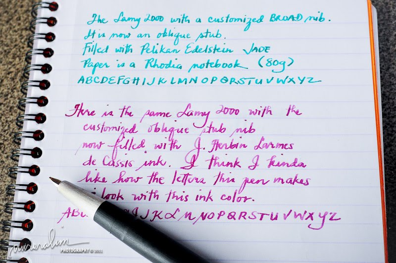
some writing samples again using Pelikan Edelstein ink (Jade) and J. Herbin ink (Larmes de Cassis)

needless to say, i definitely ❤❤❤ this pen now ...so much that it is always inked and regularly a part of my daily arsenal :-D